Two Tone and Contrasting Wardrobe Designs for London Homes
Quick Answer
Two tone wardrobes combine two finishes in a single fitted installation to create visual hierarchy, break down the mass of large wardrobes, or introduce accent colors. They work best when the color break has a clear purpose tied to function, architecture, or classical proportions rather than appearing arbitrary.
Most fitted wardrobes work with a single finish. One color, one material, one visual identity carried across every door and drawer. This approach produces calm, cohesive results that suit a wide range of rooms and remain easy to live with over time. It is the default for good reasons.
But single finish design is not the only approach. Two tone wardrobes create visual hierarchy, break down the visual mass of a large fitted installation, and introduce accent colors without committing the entire room to that accent. Done well, they read as considered design decisions. Done badly they read as chaos. This guide covers when two tone works, when it does not, the design principles that separate successful two tone designs from unsuccessful ones, and the specific combinations that consistently produce good results in London homes.
Why Consider a Two Tone Wardrobe
Single finish wardrobes have real strengths. They are simple to specify, safe to commit to, and rarely go badly wrong. But they also have limitations that two tone designs can address.
Visual weight matters in fitted wardrobes. A wall to wall wardrobe in a single dark finish presents as a solid mass across the entire wall. In smaller rooms, this can feel oppressive. Breaking the wardrobe into two tonal zones reduces the perceived visual weight, making the same wardrobe feel less dominant in the space.
Storage differentiation becomes visible. Two tone wardrobes can distinguish between hanging storage and folded storage, between his and hers sides, or between everyday and occasional use zones. The visual distinction reinforces the functional distinction.
Feature emphasis becomes possible. A single accent color on the central section of a wardrobe draws the eye to that section, creating a focal point within the installation. A dressing area, a display niche, or a central drawer bank can become a design feature rather than blending into the surrounding storage.
Ceiling height can appear enhanced. A darker lower section with a lighter upper section makes the wardrobe feel grounded while allowing the upper portion to recede visually. This can make lower ceilings feel taller.
Room integration improves. Two tone wardrobes can pick up two colors from the surrounding room rather than committing entirely to one. This helps the wardrobe feel integrated with the room rather than imposed on it.
The Fundamental Principle: Purposeful Distinction
Successful two tone designs share one common feature: the color break has a reason. The eye reads the design and understands why the finish changes where it does. Unsuccessful two tone designs have color breaks that appear arbitrary, leaving the viewer subconsciously unsettled without knowing why.
Purpose can come from function, from architecture, or from proportion.
Functional purpose means the color changes align with functional changes. Wardrobe doors are one color, drawers are another. Hanging storage takes one finish, folded storage takes another. Adult storage differs from children's storage. The functional logic gives the design coherence.
Architectural purpose means the color changes align with architectural elements. A wardrobe that wraps around a chimney breast can use one color for the chimney breast section and another for the flanking alcove sections. A wardrobe that runs from floor to ceiling can change color at the same height as a picture rail or cornice line elsewhere in the room.
Proportional purpose means the color changes create pleasing proportional relationships. A one third to two thirds split reads as intentional. An equal split reads as intentional. A ninety five to five percent split reads as an accident. Classical proportions taught for centuries in architecture apply to wardrobe design too.
If the two tone design cannot be justified through one of these three purposes, it usually should not be two tone.
Successful Combinations for London Homes
Certain combinations recur in successful London two tone wardrobe projects.
A neutral base with a darker upper produces grounded wardrobes with recessive tops. A cream or light gray lower section carries the visual weight while a charcoal or navy upper section fades into the ceiling. This works particularly well in rooms with lower ceilings where the standard advice would be to keep everything light. Making the top darker rather than lighter actually helps the ceiling recede in some configurations.
Painted with wood accent combines a painted color for the main wardrobe with a natural wood section for a feature area. The wood section might be the interior of an open display niche, the doors of a central section, or the drawer fronts within a broader painted installation. The wood grain provides texture and warmth against the flatness of paint.
Two paint colors from the same palette use two shades that clearly come from the same family. A pale sage main wardrobe with a deeper forest green central section reads as a single design intention rather than two competing choices. The relationship between the colors provides coherence.
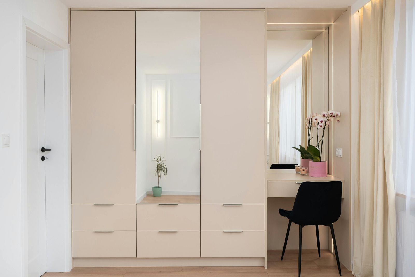
A painted body with mirrored feature doors treats the mirror as one of the two finishes. The painted section provides the color identity while mirrored doors on a central section provide light bounce and depth. This works particularly well in bedrooms where morning dressing benefits from mirrors.
Shaker doors with flat panel accents combine two door styles rather than two colors. Traditional five piece shaker doors on most of the wardrobe with flat handleless doors on a central feature section produces a design that reads as intentional rather than mixed.
Combinations That Rarely Work
Some combinations struggle to succeed regardless of execution quality.
Complementary colors placed directly against each other create visual vibration that becomes tiring over time. Red doors next to green doors, blue against orange, or purple against yellow work in commercial branding but rarely work in bedrooms.
High contrast without proportional discipline produces unsettled results. A wardrobe that is fifty percent stark white and fifty percent stark black across a wall feels aggressive rather than considered. The same colors in a proportional distribution can work well.
More than three colors almost always looks cluttered. Two tones can extend to three tones when there is a clear hierarchy, but four or more colors rarely produces coherent results in fitted furniture.
Trend colors on the majority of the wardrobe create wardrobes that date quickly. A fashionable accent on a small section can be updated later. A fashionable color across the entire main wardrobe commits the room to that trend for the life of the wardrobe.
Mismatched materials without visual connection feels arbitrary. Combining a high gloss lacquer with rustic reclaimed timber, for example, works only when the design clearly acknowledges the contrast rather than presenting it as accidental.
Proportional Approaches That Work
Successful two tone designs usually follow one of several proportional patterns.
The classical thirds place one color across two thirds of the wardrobe and the other across one third. This creates the pleasing asymmetry that classical proportion theory has recommended for centuries.
The center feature places one color across the entire wardrobe with a central section in the accent color. The center section might be twenty to forty percent of the total width. The symmetry provides visual stability while the accent provides interest.
The stacked split places one color across the lower half of the wardrobe and another across the upper half. The split line matters enormously in this configuration. It should align with a meaningful reference in the room, such as picture rail height, dado rail height, or the top of adjacent furniture.
The flanking accent places the accent color on the outer sections of a three part wardrobe, with the main color in the central section. This frames the central section as the visual focus.
The end panel treatment applies the accent color only to the end panels and reveals edges of the wardrobe, keeping all door faces in the main color. This produces a subtle two tone effect that reads as a design detail rather than a bold statement.
Handle Choices in Two Tone Designs
Hardware selection affects two tone designs more than single finish designs.
Consistent hardware across both finishes unifies the design. Using the same handle in the same finish across both sections reinforces that this is one wardrobe with two colors rather than two wardrobes joined together.
Contrasting hardware within each finish can enhance the design intention when done with restraint. Bronze handles on both a pale main section and a dark accent section, for example, provide continuity while allowing each color to work independently.
Handleless design on the accent section with visible handles on the main section can work when the accent section is intended to read as recessive rather than featured. The handleless treatment allows the accent color to appear as a pure block of color without interruption.
Different hardware on each section rarely works and should be attempted only with careful consideration of why the difference exists.
Living With Two Tone Designs
The practical experience of living with a two tone wardrobe differs from living with a single finish design.
Cleaning shows differently on different finishes. A light color shows dust and marks more visibly than a dark color, and vice versa depending on the household. Two tone designs need cleaning attention to both zones rather than developing a routine tuned to one finish.
Repainting or refinishing later becomes more complex when finishes are matched precisely. Refinishing one zone to match the other requires access to the original paint specifications or new color matching work.
Room changes over time may leave the two tone selection stranded. A wardrobe designed to pick up two colors from the current room's palette may not suit a redecorated room. Two tone wardrobes commit the room to compatible colors for longer than single finish wardrobes commit the room to a single color.
Resale considerations favor single finish designs for buyer appeal. Two tone designs can appeal strongly to buyers who share the design taste but limit the appeal to buyers who do not. This matters more for homes intended for sale within a few years than for homes intended to be kept.
Frequently Asked Questions
Do two tone wardrobes date more quickly than single finish designs?
Two tone wardrobes can date quickly if the color choices reflect current trends. Combinations based on classical proportions and neutral palettes age well. Trend based combinations across a large wardrobe commit the room to that trend for the wardrobe's lifespan.
What proportional split works best for a two tone wardrobe?
Classical proportions of one third to two thirds work reliably. Symmetrical splits centered on a room feature also work. Equal fifty fifty splits can succeed when done deliberately but feel unsettled if the split appears accidental rather than proportionally grounded.
Can two tone wardrobes suit period London properties?
No. Well designed accessible wardrobes read as thoughtful design rather than medical accommodation. Long horizontal bar handles suit contemporary styling. Bright lighting reads as luxury. Pull down mechanisms appear as premium hardware. The visual language of accessibility can align entirely with high quality design.
Do two tone wardrobes affect resale value?
Two tone wardrobes appeal strongly to buyers who share the design taste but limit appeal to buyers who prefer neutral single finish designs. This matters more for homes intended for sale within a few years than for homes intended to be kept.
What Humphries Cabinets Offers
We design and install two tone and contrasting wardrobes across London when the design intention supports this approach. Our services include:
• Fitted Wardrobes in single finish or coordinated two tone designs
• Shaker Style Wardrobes with feature sections in complementary finishes
• Modern Fitted Wardrobes with paint and wood combinations
• Floor to Ceiling Wardrobes with stacked or paneled color arrangements
• Alcove Units with feature center sections in contrasting finishes
• Entertainment Units integrating multiple finishes in living room installations
Every project starts with an in-home design visit that assesses your specific requirements before design begins.
Why Choose Humphries Cabinets
At Humphries Cabinets, we approach two tone design as one option among several rather than a signature style. Some projects benefit from the visual interest and hierarchy that two tone designs deliver.
If you are planning a fitted wardrobe installation for your London property and considering a two tone approach,
contact us today to arrange your free consultation.